Showing posts with label design. Show all posts

Tuesday, July 21, 2015

personal style, a little bit of everything


"I have the honor of interviewing talented designers for each issue of Rue Magazine, and a question I frequently ask is “how do you define your personal style?” There is often a long pause, as this question can be difficult. Yet flipping through each designer’s website, their personal style becomes obvious, even if it is hard to label.

Glancing around my own apartment, I wonder if my own style is as visible. My closet is easy. My fashion sense is somewhere between Audrey Hepburn and Katharine Hepburn. My dream home? A combination of Marcel Beuer and Antoni Gaudí… with a dash of Louis XIV."

I had the honor about writing about my confusing, conflicting, and perhaps undefinable personal style for Rue Magazine. Read it on page 40 of our latest issue and I promise the rest of the issue is just as delightful. 

Friday, April 10, 2015

a uniform is never thoughtless

"With a fairly important meeting on the horizon, I started to try on different outfits, lacking any real direction or plan. "Is this too formal? Is that too out there? Is this dress too short?... As I arrived at work, my stress level only increased as I saw my male creative partner and other male co-workers having a "brodown" with the new boss as they entered the meeting room—a room I was suppose to already be inside. I just stood there—paralyzed by the fact that I was not only late, but unprepared. And my sweater was inside out." 

Matilda Kahl's piece for Harper's Bazaar was the first article on wearing a self-imposed daily outfit that hasn't left me wanting to tear our my hair. (See: Stuart Heritage in The Guardian's How to be as successful as Obama and Zuckerberg: wear the same clothes every day. It may work for the President but how would that work for Michelle Obama?) 

I like Kahl's piece because I agree. Uniforms can be powerful. I love Janelle Monae's commitment to her black and white style and have long expressed admiration for the architecture professors of the world who look chic in daily black. Her feeling of panic  at getting dressed is one I have felt many times and I, too, have a standard look that I put on no matter the situation when I'm unsure- dark jeans, a button down shirt, and some oversized necklace. 

Kahl and Heritage agree that thinking about exactly what to wear takes up amount of time and brain space, sometimes distracting from other things that need to get done. Heritage however frames it as time that the busy men he profiles just can't be bothered to take. That taking the time to think about clothes is trivial or a waste. What Kahl gets, perhaps better than most given her job as Creative Director, is that no matter what we wear we send a signal. Zuckerberg does it in his hoodie, and it's a signal that works for him both because of who he is and what his surroundings are. It would not work for President Obama for the same reasons. (And when Zuckerberg met Obama? He wore a tie.) Kahl saves herself time now by wearing a uniform, but it only works because she thought through a work outfit that would always be appropriate. 

Me? I'm not giving up a rainbow of colors (okay, yes, mostly blue and green and sometimes red.) But I get it. Now excuse me, I've got to throw on a button down and get to work. 

Tuesday, November 4, 2014

Sunday, October 26, 2014

read more: the better-writen bio that could be mine

"I struggle often to justify my love of aesthetics. I love to rearrange furniture and choose lipstick shades and curate art collections and have amassed more than enough statement jewelry over the years, and I sometimes treat these gifts as if they’re burdens. I sometimes wish I could trade these passions for something more “worthwhile” – whatever that means – and then I realize how ridiculous that sounds. Gifts are gifts. Passions are passions. We don’t choose them; they arrive, packaged in cardboard. They’re often bubble-wrapped, I think, and sometimes I use that same bubble wrap to suffocate them. Lately I’ve been working really hard not to do that, and instead, to pop the wrap a bit at a time with a new challenge (pop) or project (pop) or pursuit (pop pop pop)."
- Erin Loechner, Design for Mankind on writing her 'real bio' 

Tuesday, February 25, 2014

functional is design. beauty may not be.

Over the weekend I spotted an article in The New York Times being grumpily passed around Twitter. Reading quotes like the following made me grumpy, too:

When Peek, a start-up for booking travel activities, designed its first iPhone app, its co-founder and chief executive, Ruzwana Bashir, said she prioritized design over other factors. The app shows large photos instead of a list of activities, for instance, even though it meant Peek could not fit as many activities on each screen.

Designing Peek to have less activities per screen because it looks better is not design. Designing Peek to have less activities per screen because showing large photos makes it easier for users to navigate the app is design.

Unfortunately, this article was another story making a false distinction between how something works and how something looks. It refers to the former as 'function' and the later as 'design,' but really the design is how the two interact.

This is not to say all the examples in the article failed to be design. After all, in other cases the aesthetic improvements also increased usability. Despite the constant confusing of aesthetics as design, the concluding sentence gives hope: "first and foremost I look for empathy, because design is not art, it’s actually solving real problems for people."

Design can be functional. Design can be aesthetics. But design can never ever be aesthetics over function.

Sunday, February 23, 2014

Three steps to GoldieBlox's Success

GoldieBlox, a construction toy aimed at young girls that teaches the basic principles of engineering, has been in the news lately due to their Super Bowl ad sponsored by Intuit’s Small Business Big Game contest. I had the privilege of working for GoldieBlox almost two years ago. (In fact, the first post I wrote about it is here.) I’ve been delighted to watch its success, including Fast Company’s recent nod as one of the 50 Most Innovative Companies of 2014. The award is well deserved, but founder Debbie Sterling’s innovative approach to creating GoldieBlox is a lot deeper than one amazing idea. Not surprising given Debbie’s degree from Stanford in Product Design, her process for creating GoldieBlox was intentionally designed. Debbie is the type of client every designer is lucky to work for because she understood the work that is required to make innovation happen.

Step One: Research
Before Debbie created the toy that now is GoldieBlox, she started by understanding her audience. Debbie read research and spoke with child development psychologists to understand the way that young girls want to play. She realized that many young girls enjoy story based play and start reading at an early age. It was from these initial conversations that she came up with the building set and story combination.

Step Two: Bring others into the process
Debbie reached out to broad swaths of people. She rejected the celebrated trope of a lone creator, understanding that innovation is made better by having ideas get beaten up and improved. I was always impressed by how willing she was to talk to anyone interested about her idea and through that she was able to build a strong team.

Step Three: Test and revise
Even after initial user research proved that young girls were responding positively to GoldieBlox, Debbie continued to ask the design team to identify ways to revise the toy to enhance the learning experience. She was not satisfied by merely proving her initial concept but pushed to make the best possible toy before launching the Kickstarter campaign, and has continued to improve the toys and expand the line. I look forward to seeing what comes next.

Saturday, February 22, 2014

read more: sustainable web design

"How can the web have a sustainability problem when 'paperless' and 'eco-friendly' frequently share the same sentence? After all, designers in many disciplines are trying to fix their own sustainability problems by moving them online – in other words, things are made 'green' when they go on the web...While some products become more sustainable by converting them to a swarm of bits, we must remember that those bits require something very physical to exist – a big, high-tech network, using lots of electricity and always-on computers to operate."

Saturday, October 12, 2013

read more: the duty of design

"It is enough for good design to be things we cherish because they are beautiful, well made, or a pleasure to use, but it seems to me that our daily lives are dominated by barely competent and sometimes downright sinister works of industrial design, and I do not understand why designers don’t spend more time chasing down these opportunities.

The whole infrastructure of security and surveillance that dominates our experience of the city today (to take just one example) has gone untouched by the field of product design in any meaningful way. These are works of design that take justice and trust as their topic, and they make it pretty clear how those in power think of us as citizens."
Kieran Long, On the Civic Duty of Product Design for Dezeen 

Tuesday, November 20, 2012

design like you give a damn

[Tshirt. From Selfless Tee]
 Last week was packed. There was exciting news (Partner-in-Crime passed his grad school 'qual' and is now an official doctoral candidate.) There were parties (pre-launch party for the wonderful brika.com curated shop.) But mostly there were conferences. I attended both Greenbuild and Architecture for Humanity's Design Like You Give a Damn conference.

I struggled to think of how to share all the amazing stories and projects I learned about at DLYGAD and was thrilled to find out the presentations are all online. Check them out here. The conference was quite packed so I only saw two of the four panels- on EcoDesign and Security, along with the keynotes. Sadly, the amazing open mic talks are not included. For six hours, participants gave a 7 minute talk on a project they had completed. I spent the first two hours of the conference mesmerized and could have listened all day if not for the panels that occurred at the same time.

When I arrived, I was surprised at how far many participants had traveled. By the end, I understood why. Though just a one day conference, it was worth traveling to be there. Every participant and speaker deeply cared about design for good. Hope to see you all there next year. Until then, I'll be watching these videos when I need some inspiration.

Monday, October 29, 2012

weathering Sandy together

I spent the night working on another post about some exciting news, but kept returning to news of Sandy and the devastation wrought on the East Coast. Reading Facebook and Twitter to check on friends, I saw several posts asking why New York City, in particular, was not better prepared. The answers to that are myriad, but it got me thinking what could be done better in the future. Sadly, storms like Sandy are only becoming more frequent. No single weather incident can be directly linked to climate change, but Sandy fit all the checkboxes, including that the sea level rise was far greater than predicted.

So what can be done to better prepare? Beyond the macro-level of major construction renovations and government programs, there are many small scale possibilities. 

Code for America developed Prepared.ly to help citizens in Austin prepare for wildfires, including checklists and the ability to track your progress securing your home, real time information on risk, and direct connection to fire safety professionals. Imagine an app that helped local residents prepare for a storm including checklists for grocery shopping and prepping the home, tips on safety in case of power and water outage, up-to-date storm information, and the ability to send information to emergency responders. 

Much of the concern for safety in a storm like Sandy is the ability to either evacuate safely or prepare to wait out the storm. With the rise of the collaborative consumption economy, what are the possibilities for collaborative evacuations and storm preparedness? Imagine Lyft, Zipcar, and RideShare all coordinating drivers with passengers. Less cars on the road makes a quicker evacuations and helps ensure those without wheels have a way out. Airbnb users in safe areas could post emergency availability at affordable rates so cost wouldn't be a hinderance. For those in affected areas who do not need to evacuate, what are the collaborative possibilities for buying supplies instead of grocery stores being flooded with panicked shoppers hoarding water? 

Clearly, these are only a small part of the solution. For instance, many of those most at risk are elderly, and less likely to be utilizing these forms of technology. But what if, from the West Coast, I could secure a safe ride for a family member in New York online or if, through an app, could find someone in her apartment building to check in once the power and thus, her phone line, went out? 

There are better ways for us to design our cities to deal with changing conditions, but there are also ways for us to design around our changing society to build better communities that are able to weather storms together. Let's figure them out. Fast.

Until then, please consider donating $10 or how ever much you are compelled to the Red Cross for the Disaster Relief fund. It truly all makes a difference. 

Monday, March 26, 2012

99% invisible on universal design


I've been meaning to write a post on 99% Invisible. Every episode of the design and architecture themed podcast is excellent, but when the latest started with a clip of a walk-and-talk from West Wing I knew it was time to share. 99% Invisible used the clip as a segue to talk about the way we talk when moving through space and the different spacial challenges faced by the deaf community when walking and communicating. The only thing the episode missed was a shout out to Joey Lucas, the deaf character who could walk and talk with the best of them. (The best forever being Sam Seaborn and Josh Lyman.) 

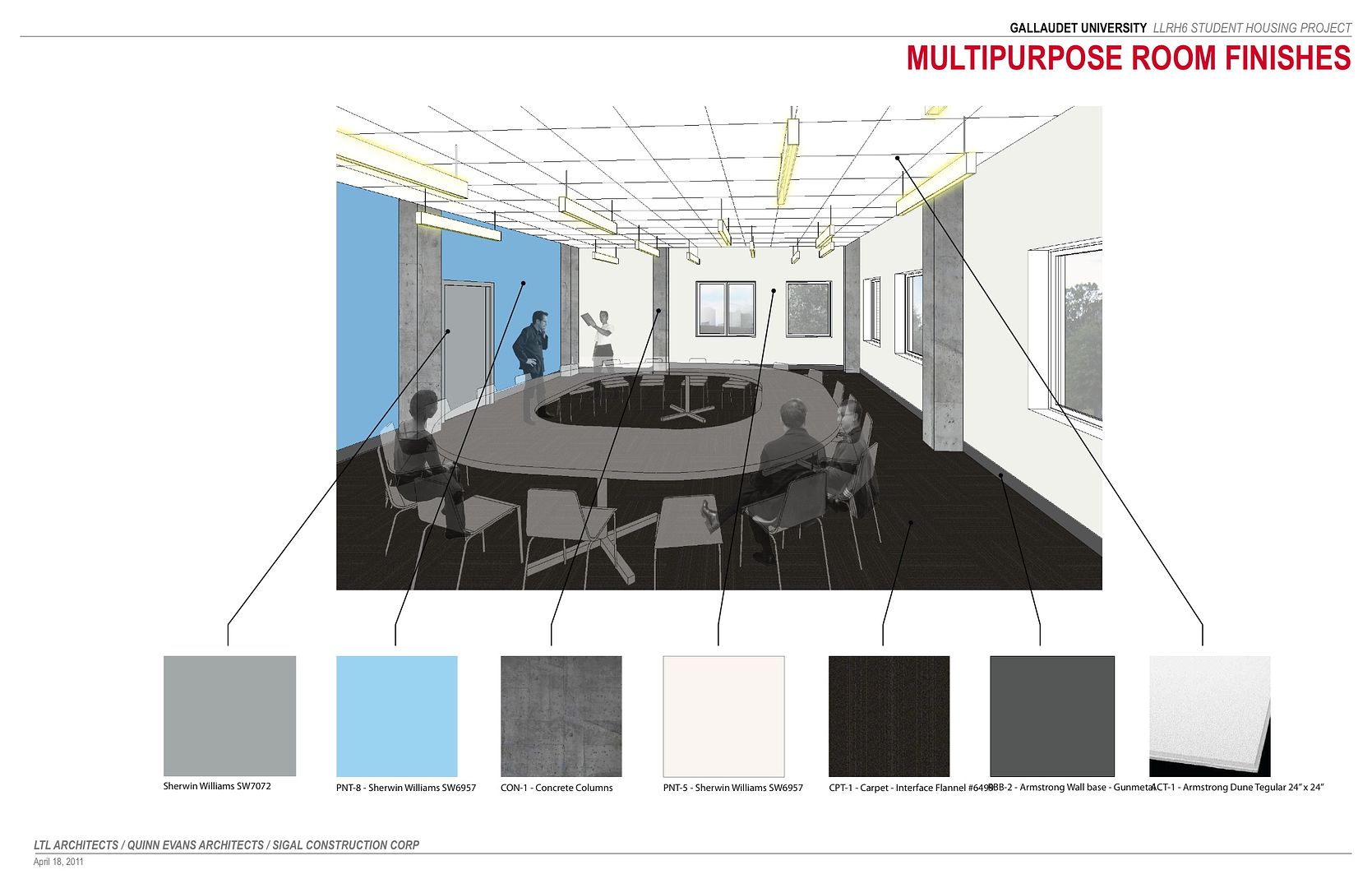
Robert Sirvage is a deaf designer, researcher, and instructor at Gallaudet, and in collaboration with Hansel Bauman — who is not deaf – and a group of staff, students and architects, they’ve developed a project calledDeafSpace. Reporter Tom Dreisbach took a tour through the new building at Gallaudet that is incorporating the innovations of DeafSpace to create an environment more pleasing to everyone, both hearing and deaf. 

[Plans for a residence hall by by LTL Architects / Quinn Evans Architects]

The show had many insightful moments and somehow I learned more about designing for the hearing-impaired than I had in my four years of design school. Mind you, I loved my program but I can't remember specifically discussing the issue (though I'm having flashbacks to diagrams of the structure of the inner ear.) More than designing around the lack of hearing, Sirvage and Bauman designed to reduce the eyestrain that accompanies replacing auditory clues with visual ones. Blue walls help provide the greatest contrast to a wide variety of skin-tones. An attempt to round walls to increase sightlines lead to increased collisions, so glass corners were suggested instead. Diffuse lighting. 

While I joked that the West Wing clip prompted this post, it was more accurately a short quote at the end. "Fundamentally this is about universal design, designing for the widest range of people possible with a variety of abilities because not only is it more inclusive, it's demonstrably better design, regardless of need." 

As designers, by studying a wide variety of specific population's needs, we are able to best design for the widest group at all times. 

Thursday, December 15, 2011

design intervention: doing it right

[Santa Marta community, Rio de Janeiro, image from Favela Painting]

I love the colorful buildings of artistic team Haas & Hann's projects. The duo's favela project, originally conceived in Brazil, pays local youth to paint buildings vivid shades. I love that the project is "not about cosmetically 'camouflaging' an area, but rather rejuvenating deprived areas of a city and creating a positive social effect on the general district at hand." I was first introduced to the pair's work on Apartment Therapy when in an article titled "Should New York Go Neon?" The proposed images of New York were thrilling to me, but the article and the idea struck me as misguided. The proposal of an unsolicited "intervention" in lower Manhattan from a pair of designers from outside the United States lacked the community input I think is necessary for a project to be truly uplifting instead of just aesthetically pleasing. And while they certainty are pleasing to me, many may find the colors an eyesore especially without community consultation and buy-in.

[Proposed NYC project, image from Apartment Therapy]

Tonight I took the time to look at the Favela Painting website in more depth. There were things that heartened me, such as the education in painting skills and safety the local youth received, which can serve as job training. Additionally, "inside of the sambaschool was painted in [the area's] traditional colors"

While of course there are many other improvements that could be made to those communities (either in Brazil or New York,) even small physical appearance changes can have a very positive affect. The Favela Project was started in 2006 in Brazil where the Dutch team works and lives, and the New York proposal was more of a creative design exercise than true proposal. I would hope a team that has had such successful projects in the past understand the important of community in the design process should such a project actually move forward. What works in one community does not translate to all communities, especially if the similarity in the communities is largely on of economic status or political power instead of culture and identity. I encourage Haas & Haan to continue the painting project in Brazil if it as welcome in the community as my google-ing suggests but to think deeper about ways to bring the same joy to other cities.

What do you think are best practices for community-based design?

[Painters at work in Rio, image from Favela Painting]

Tuesday, November 15, 2011

america recycles day (intro to three part series)

[Alejandro Durán's Washed Up Series]

Today is America Recycles Day and kicks off a series I’m writing on recycling and, more broadly, the three R’s. We all remember the three R’s from school (those of us born in or after the 80s at least.) Reduce. Reuse. Recycle.

These are important Rs for designers too. We, as designers, are responsible for the products we create. We pour our heart into their creation and then we hope to send them out into the world. But what happens to our products after? Are they still our responsibility? How can we make our designs comply with the three Rs? This is an issue close to my heart, merging the work I've done on climate change and sustainability with my love of design. Over the next two weeks, I’ll examine each R and discuss ways designers have taken them into consideration in their work.  

What do you think a designer’s responsibility is? Please share thoughts as well as any great examples of designers imagining great solutions to the three Rs.

Tuesday, March 29, 2011

tools for schools


If I learned anything from design school, it is that design is a process. It is a way of thinking and problem solving. But, as Aruliden design studio found after working with a group of eight graders as The School at Columbia, it isn't taught. Not that young people don't have an amazing capacity for design thinking- after all, who is more creative than kids- but the process isn't incorporated into school curriculum.

Aruliden co-founders Rinat Aruh and Johan Liden partnered with furniture company Bernhardt Design to create Tools for Schools which was "fully integrated into the School at Columbia's yearlong curriculum. It became part of math class, where students studied ratios and proportion; science, where they investigated materials; and English, where they worked on their presentations. 'The theory is, if you have deep learning, you have more hooks to attach new learning onto," says Annette Raphel, head of the School at Columbia. "When you get out of school, that's what really happens. You don't learn math to pass a test but to solve problems that require math skills. That's bigger than a standardized test.'"

The students designed around challenges in their own lives- their desks, chairs and lockers. Check out out their solutions.

Originally found on Fast Company.

Thursday, February 24, 2011

a year in an image

I could have sworn I posted about this earlier, but perhaps I only meant to. Vogue covers from 2010 overlaid on each other. Interesting how Vogue in different countries styles itself. Some, like the US have a very consistent format, allowing an image to form in the center of the overlay with the text stacked neatly on the sides. Others, like Vogue Paris, seem to take more risks from cover to cover. All 14 covers together form a very clear image.

[Vogue]


See more images.

Thursday, August 26, 2010

design for humanity: plastic bottle dining

Wouldn't you love to have a romantic meal on this floating dining room?


So luxurious.


With a little secret under the deck. (Well, not too secret since there is a peep window to below.)


Plastic bottles keep the raft afloat.
This beautiful dining room is a special project of the School of Fish Foundation, a non-profit organization that provides curriculum and subject materials for sustainable seafood preparation. Built by Goodweather Design, "the floating plastic represents the issue of our oceans becoming a collecting ground for discarded plastic; one of the many threats to our seafood supplies."
A six-course sustainable and seasonal seafood dinner (say that six times fast!) is catered nightly by C Restaurant. You'll have to travel to eat there, however, the dining room raft is moored at the False Creek Yacht Club in Vancouver, BC.

I find this design stunning and an elegant educational tool, though the price of dinner will keep many from enjoying it. Imagine this used to build inexpensive rafts for public swimming at lakes, though. What other applications could this idea be applied to?

School of Fish Foundation found originally at Re-Nest.

Monday, August 23, 2010

trailor park hotel


I love old trailers. I love turning things into something unexpected, breathing new life into old objects. This trailer is part of a set that make up the El Cosmico hotel/motel/campsite. I've stayed at a trailor park motel. It looked nothing like this.


I'm having trouble uploading pictures but check out more images here.

Originally found on the amazing HonestlyWTF here.

Thursday, July 1, 2010

little charlotte's a big girl now


Charlotte, my hometown from middle school on and a city that wishes it was Atlanta, recently had a coup. The Bechtler family donated their extensive art collection to the city, creating the new Bechtler Museum. The family's collection of modern art is amazing, collected by the extended family. Currently around 10% of the collection is on display, the museum will rotate the collection every six months. I look forward to return visits to see the rest. Luckily, I won't miss the current collection when it's gone- for my birthday, my parents gave me the catalog of the collection!

In addition to the art, the architecture is also amazing. The slim four-story building, attached to others in the Wells-Fargo Cultural Center, was designed by Mario Botta. His use of terra cotta contrasts with the stark interior and some of my favorite pictures are how the outside/inside/art intertwine. In addition, the space is connected to the performance space next door and interacts with other parts of the cultural campus.

[Vive Moi (Long Live Me); Niki De Saint Phalle]

[Untitled (Water Buffalo); Jean Tinguely]

[Garden Sculpture (Model for Meridian); Barbara Hepworth]

[view from second story balcony, in]

I didn't get to take pictures of my favorite floor- the fourth floor is full of beautiful paintings, but a few of my very favorites are on the website. If you find yourself in Charlotte, this is the must see museum in town (other than the Nascar museum, of course!)

Friday, March 26, 2010

When I went to design school, this is the type of work I hoped to create. While my life has made some turns, someday, in some way, I'd like to have tangible spaces like this to point to as my life's work.

Achievement First Endeavor Middle School, a charter school in Clinton Hill
by Paula Scher and Pentagram design team

Thursday, February 25, 2010

brian jungen

Currently at the Museum of American Indian. From the promotional materials:

Brian Jungen turns objects inside out. By deconstructing them, he changes not only the things themselves, but the ways we think about what they used to be, and what they've become.

He begins with objects that are ordinary, useful, and comforting. When he's through, they are unique, expensive, and useless.

Jungen explores the intersection of art and Indian artifacts, by creating masks, totem poles, bones, and other 'Indian' items out of everyday materials. I took a few photos and wish I had taken more.