Tuesday, September 4, 2012
recommended reading: logo life
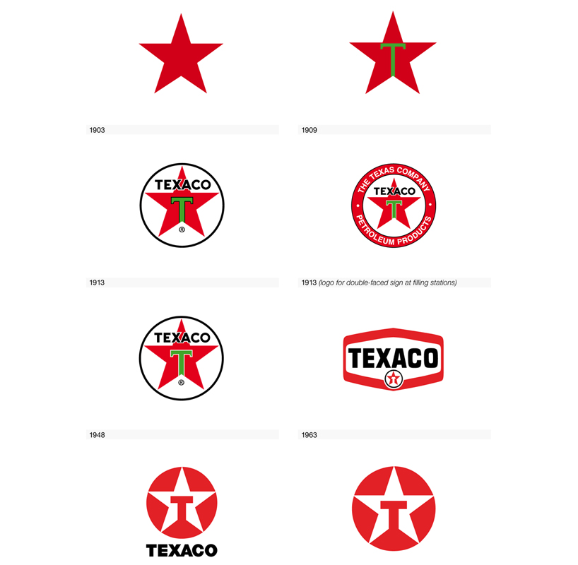
On my bookshelf wish list is Logo Life by BIS publishers which chronicles the evolution of 100 of the most recognizable logos. Many of the logos today are modernized and simplified version of an early logo. The Texaxo logo is great example. The "T" within a star has been part of their logo 1909. The typeface for the T has been consistent since 1963. Over the course of a few transitions, an inversion of colors and removal of surrounding text and images has lead to the recognizable logo today.
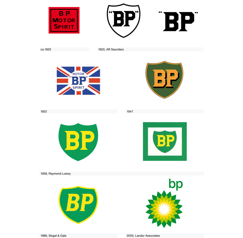
There are exceptions, for instance, BP's logo has a sunburst pattern that replaced the shield of its previous iterations. BP's new logo, however, was part of an intentional rebrand meant to shed past unpleasant associations of BP and instead brand the company as forward thinking and environmentally friendly.
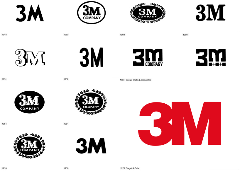
I was surprised to see so many logos for 3M, but unsurprised they chose to return to their original idea of just the name, 3M, without fancy trappings but modernized through font, spacing, and color. Flipping through the preview pages, it was clear more companies followed the Texaco plan of simplifying and modernizing an iconic mark rather than reinventing. Reinventing is far riskier, even playing off existing marks can be tricky, as GAP realized in their shortlived 2010 attempt. Done correctly, modernizing a logo can revive nostalgia for times when the company was strong while giving it a fresh new appeal.
Images from Designboom.
Labels:
bis publishers,
graphic design,
logo,
logo life
Subscribe to:
Post Comments (Atom)


No comments:
Post a Comment