Tuesday, September 18, 2012

my secret is out- goldieblox is live!

[I can't believe I finally get to share this picture!]
I'm please to announce that GoldieBlox is here! Back in March I posted my excitement to be working on a secret project, now I'm finally able to share the details. 

GoldieBlox is a construction toy for girls, that is going to inspire the next generation of female engineers. Their mission is to get little girls interested in science, technology, engineering and math the way Lego, K’Nex, Lincoln Logs and Erector sets have done for boys for over 100 years. The idea behind GoldieBlox is genius: it is a construction set + book series starring Goldie, the girl inventor who loves to build. As girls read the book, they get to build along with Goldie. 


GoldieBlox is on its way to being commercially produced, but we need your help. There are three simple actions you can do to bring Goldie to life:
1. Visit the Kickstarter page right now and make a contribution.
2. Like GoldieBlox on Facebook, Follow on Twitter, and Join the email list.
3. Reach out to your personal, professional, and social networks to spread the word.

Sunday, September 16, 2012

tumblights: 9/16

It was a whirlwind week coming back from New York and launching the Rue Anniversary Issue. I can't believe a week ago I was in New York and still had three stories to write. Yesterday was a lovely day off exploring San Francisco with Partner-in-Crime. Check out my Instagram (@percentblog) for our adventures. I came home in the early evening and finally caught up on blogs and tumblr.

When I went to review what I had tumbled and put together today's tumblights, I thought the way they were arranged on the page was already perfect, so here is a slight deviation from the typical form. The top simple and minimalist. The bottom a riot of color. My week in images.

Was your week more minimal or more color riot?

From top left: 

Enjoy these? Find more daily at percentblog.tumblr.com. And even more stunning images on my pintrest.  

Friday, September 14, 2012

read more: pop-up populism


The pop-up "approach favors low-cost projects, incremental steps, and high levels of community engagement. Its implementation is widespread, ranging from pop-up marketplaces and pavilions to seemingly cosmetic but effective city planning reforms. Small budgets meet less resistance and allow for faster execution, which means the effects of these interventions can be felt more immediately. As a result, the schemes can be adapted as needed, responding quickly to the successes or failures of their forms. Moreover, these projects are often initiated by locals, diverse groups of individuals who can see the demands and aspirations of their respective communities firsthand. The results often become a more direct and intimate response to their sites." [from Kelly Chan for Artinfo.com]

This past weekend in Brooklyn I stumbled across the DeKalb market and had been been meaning to google more about the space. This morning I found an article "Pop-Up Populism: How the Temporary Architecture Craze is Changing Our Relationship to the Built Environment" and wanted to share this quote. Check out the whole article for more interesting thoughts on how cities are evolving. 

Wednesday, September 12, 2012

rue turns two


Rue turned two today! Our second anniversary issue launched this morning and I am so proud of our team. Look for my byline on 'Treehouse in the Sky.' My absolute favorite story? The amazing modern Hitchcock themed fashion shoot shown on our cover. Lovely!

Tuesday, September 11, 2012

remembering 9/11, remembering friends

[Image from Local Projects]

Memorials are a tricky thing to design. To capture a moment and all the lives involved in a way that will resonate for generations is no simple feat. With her design for the Vietnam War Memorial, famously done as a college student, Maya Lin changed memorial design. I remember visiting it in high school. I stopped by several monuments and memorials, without making much of a connection, until my group arrived at the Vietnam Memorial.

[Image from Local Projects]

Today on the 11th Anniversary of 9/11, I want to reflect on another memorial. For the Ground Zero memorial, the Local Project continued Lin's legacy of putting the individual people lost at the center of their design, while updating the ordering system to account both for technology and for the personalities behind each name.  Maya Lin listed the fallen soldiers by the year of their death and then alphabetically. New York based media design firm Local Projects collected 1,800 requests from families of the 9/11 victims and worked out an algorithm to list them with their friends. Groups of firefighters listed together, police officers, members of each plane, office mates and friends. Even strangers who met trapped in the tower and were each other's comfort. A website, names.911memorial.org, was created to aid in finding names at the memorial.

When we remember the people we've loved, we want to remember them as they were. This is why we write inscriptions on headstones. Local Projects ensured that generations from now the victims of 9/11 will not be merely names but people.

Thursday, September 6, 2012

off to new york

[The evolution of New York City's skyline]
I'm off to New York for a childhood friend's wedding, sadly without Partner-in-Crime. Looking forward to a lovely reunion with family friends at the ceremony, along with visits with high school and college friends. Plus, I am going to see The Book of Mormon.

I'm also thrilled to be joining editor Victoria and the wonderful photographer Emily Anderson to shoot a stunning Home Tour for Rue Magazine to be published in our upcoming second Anniversary Issue (out on September 12!)

My last visit to New York was a quick trip just before moving to Berkeley, never enough time in this wonderful, overwhelming city.

Image via Tier1dcOriginally found via SwissMiss

Tuesday, September 4, 2012

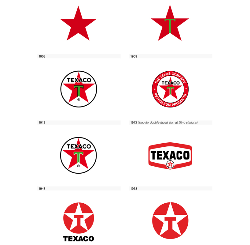
recommended reading: logo life


On my bookshelf wish list is Logo Life by BIS publishers which chronicles the evolution of 100 of the most recognizable logos. Many of the logos today are  modernized and simplified version of an early logo. The Texaxo logo is great example. The "T" within a star has been part of their logo 1909. The typeface for the T has been consistent since 1963. Over the course of a few transitions, an inversion of colors and removal of surrounding text and images has lead to the recognizable logo today.

Sunday, September 2, 2012

tumblights 9/2

In honor of the upcoming fashion week, this weekend's tumblights are all about fashion. In this case, about fashion that's doing things a little differently. Shoes that support independent artists, gorgeous eco-resin jewelry, fashion illustrations that incorporate stitching, and a shopping bag that gets a second life as a coat hanger.


Clockwise from top:

I'll be in New York next weekend. I won't be attending any shows but am hoping to spot some fabulous outfits on the street. How are you celebrating Fashion Week?