Wednesday, June 20, 2012
international rue launch
The newest Rue has launched, and this issue is all about travel! I had a blast writing for this issue and day dreaming about trips to take someday. Chloe from MiH Jeans (pg 24) was a delight and I actually got to speak with her over the phone while she was in Turkey, but Belgian photographer An's home in Malaysia (pg 118) was my favorite because her home is so clearly a reflection of her love and passions.
Take your own mini-trip with 144 pages of around the world inspiration!
Sunday, June 17, 2012
tumblights: 6/17
(Clockwise from top left)
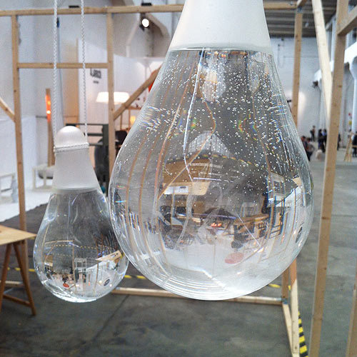
4. ‘Sculptographer’ Peter Madden's work of found objects encased in safety glass via This is Colossal
Enjoy these? Find more daily at percentblog.tumblr.com. And even more stunning images on my pintrest.
Thursday, June 14, 2012
3 keys to big picture sustainable design
 |
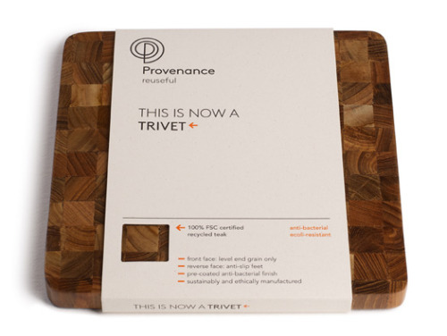
| [Provenance Trivet and package design] |
Sustainability is a buzz word, and has been for years now. It feels like the Next Big Thing, yet alternately feels like little has changed and the debates over what is and isn't sustainable rage on. Nitpicking frustrates me. I'll admit, incremental change can frustrate me. It's important but frustrating. As designers, we can tweak our designs and tweak materials, but truly sustainable design comes from focusing on the big picture. After all, as Steve Jobs said, design is more than the veneer. Design is everything.
The three keys to big picture sustainable design:
 |
| [Underground house by De Matos Ryan connected to historical stone tower] |
Sustainable design lasts. We have to get back to designing durability. We have to get back to designing products, buildings and experiences that we want to keep. More than just designing out planned obsolesce, we have to design in quality that users will want to keep.
 |
| [Jelloware by The Way We See The World] |
Either in the original form or as a series of parts, sustainable design can adapt to changing needs. Either it can be broken down into its parts to be updated or the whole product can be used for an additional purpose. If the item must disappear, it can do so without a trace.
 |
| [Anti-fly Sphere by Jose de la O] |
The product functions as required so it does not need to be replaced, and, equally important, it is a joy to use. If you delight the user, they will value your design and therefore preserve it.
Sunday, June 10, 2012
tumblights 6/10
This week has apparently been all about simple wood forms, a coffee table, a chair, lamp, a series of linear furniture. But each one also has something a little special. The coffee table contains a prism that marks time, the chair back is inverted in the shape of the seat, the forms contained in the lamp, the furniture snaps together without tools. Each simple but full of simple delights.
Enjoy these? Find more daily at percentblog.tumblr.com. And even more stunning images on my pintrest.
(Clockwise from top left)
Sunday, June 3, 2012
no loitering
I recently spent almost a week in the greater Boston area at the StartingBloc Institute for Social Innovation with an amazing group of people. After it ended, I stayed at a high school friends and spent the afternoon wander her neighborhood of Davis Square before my evening flight. I wrote this post on a small yellow legal pad and have tried to transcribe it, accurately capturing my feelings and reflections.
Wandering Davis Square I was impressed by the blended neighborhood of small mom and pop shops, a Post Office, copious restaurants of different cuisines and price points, and even a Planned Parenthood "Express Center." I could have gotten my shoes repaired, a tattoo or a passport photo taken, all on the same block. It was an instantly comfortable neighborhood, clearly in a city but with open courtyards and parks that kept the cityscape from feeling rushed and impersonal.
Then I noticed this sign. In a plaza with outside seating plus open benches under trees for seating. I wondered how long it was there, what caused the owners of the building to put it up*. The Urban Equity Development Center pulling a move directly from the Arsenal of Exclusion playbook.
Of course, like most signs, it was ignored. As I ate my lunch, I watched waiters on break having smokes at the back of the plaza, folks cutting through the plaza from one street to the next. To me, it didn't disrupt what I had already observed. But I had paid to sit in the plaza for lunch, so I can't speak to what one of those cutting through the plaza would have felt if he had a decided to make a phone call, sat down on a bench, and mid-call had noticed that sign.
*I will note, due to the proximity of the PP clinic, the sign could actually be a preemptive step to allow the owners to actually make a distinct population safer by shutting protesters out. This particular sign may have good intentions, but the reflections remain true of "No Loitering" signs in semi-public spaces throughout cities.
Wandering Davis Square I was impressed by the blended neighborhood of small mom and pop shops, a Post Office, copious restaurants of different cuisines and price points, and even a Planned Parenthood "Express Center." I could have gotten my shoes repaired, a tattoo or a passport photo taken, all on the same block. It was an instantly comfortable neighborhood, clearly in a city but with open courtyards and parks that kept the cityscape from feeling rushed and impersonal.
Then I noticed this sign. In a plaza with outside seating plus open benches under trees for seating. I wondered how long it was there, what caused the owners of the building to put it up*. The Urban Equity Development Center pulling a move directly from the Arsenal of Exclusion playbook.
 |
| [Instgram-ed for effect] |
Of course, like most signs, it was ignored. As I ate my lunch, I watched waiters on break having smokes at the back of the plaza, folks cutting through the plaza from one street to the next. To me, it didn't disrupt what I had already observed. But I had paid to sit in the plaza for lunch, so I can't speak to what one of those cutting through the plaza would have felt if he had a decided to make a phone call, sat down on a bench, and mid-call had noticed that sign.
*I will note, due to the proximity of the PP clinic, the sign could actually be a preemptive step to allow the owners to actually make a distinct population safer by shutting protesters out. This particular sign may have good intentions, but the reflections remain true of "No Loitering" signs in semi-public spaces throughout cities.
Subscribe to:
Comments (Atom)


